So you're wanting to make a website right? That's probably why you're reading this, either that or you're poking around the Breakroom. I should note before we get into this that I am not a professional with making websites, I'm simply wanting to give some basic information that I would have found useful when I first started. If you are interested in diving into web development deeper, check out the MDN Web Docs. Now that all of that is out of the way, lets get into some basic web development.
Chances are, with your first website, you'll want to dive head first into coding and making your website look as beautiful as can be. You look up the basics of html and css and eventually create your masterpiece! Only to save it, and view it just to find out it looks like Homer's Web Page... but there's no need to get hung up on that! Any piece of art is beautiful, but I doubt that's how you want to leave it.
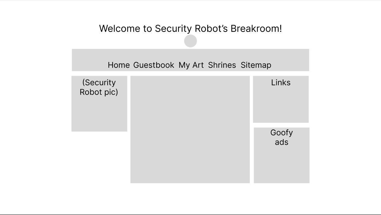
The easiest way to develop your layout is to use something like Figma which allows you to build layouts for things like websites but even a pen and paper does everything you may need in creating a website (in fact, I would even say that it's better to do that rather than learning how to navigate another program). You might be unsure of where to even begin in the layout, though. Do you have a sidebar? Where do you link to other pages? Should art be shown on the main page or on another page? Oh god... my head is spinning already... but guess what! You have other websites to look at! I found it easiest to make the layout of my website by looking at others and picking what I liked and then putting it together in my layout. I landed on a 3 bar layout with a header that links to the other parts of my website, but yours can look however you want it to!
With the layout down, it's time to actually build it. There's a lot to HTML but the basics cover a lot of ground. Paragraphs, lists, and links are more than enough for a website, you certainly don't need any more than that. If you don't quite understand what I mean, check out justinjackson.ca/words.html. But HTML isn't just text. Why not emphasize it or make it seem important? Your words are YOURS and no one can take that! So show it off, no need to make fancy. In addition to all of this, HTML lets you put in  ,
,  , and even videos without any special wizardry! Before making everything look pretty, it's best to put down the stuff you know you want. The headers, intro, and images give you a good idea of where your website might go in the future.
It'll get hard to control everything after a certain point, though. The text and lists flow nicely down the page but the varying sizes of image making awkward breaks and, depending on how much you write, the website can become very long. Now's the time to put that layout to use. Websites use something called "Cascading Style Sheets" (CSS) which have a variety of functions that allow you to change how things work. Style sheets typically come in their own files however, you can write them directly in .html files as well. It's generally easier to put them in a single file, though, as it allows you to have multiple parts of your website to look similar without having to copy and paste code across all of your HTML files. Keep in mind that you aren't limtied to one css file when making your sites, as you can make another for perhaps a shrine so that it can have the look that shows how much you love a certain thing. You may try experimenting with stuff like borders or margins but run into the problem of including an image and text in within a single border. To fix this, you are going to have to add something called a "division" which essentially creates an invisible box around one thing. You can resize it and do whatever you want with it, but they tend to be quite finicky to mess around with in style sheets. To get the proper shapes for them you will have to change padding(the space between content and the border), the border (typically the outline around content), and the margin (the space between the edges of a website or even between other divs). If there is one thing I've learned from working with these functions, it's that percentages are your best friend. For someone like me, I wanted my website to be useable across any device so that required "responsive web design" which means that content will automatically resize itself so that it work across devices. Now, sometimes you may run into the issue where, even with percentages, the content falls out of the divisions and overlaps with other parts of the website. There are a couple of ways to go about fixing this; either by setting the height or width to "auto" which means the division will resize itself to the always fit around the content, but it's best to only leave that for the height, or using a percentages. If you have a more column-like design then percantages can give you the size you want while adjusting to screen size so that it can look similar across platforms. The next best way to deal with the issue of responsive web design is with something called "adaptive web design" in which the placement of content on a website will change depending on the screen size. I personally use this so that I can keep the necessary parts of my site on smaller devices and keep the more unnecessary details for computers. To use this in your website, you will have to use the @media rule and specify the screen size in pixels in paranthesis next to the rule. Keep in mind that when doing this, you will be essentially creating double, triple, or even quadruple the work depending on how many screen sizes you want to allow for. Many websites, especially those in the indie-sphere, prefer to keep their websites as computer-compatible only so that they can be easier to manage, which is perfectly fine. You don't have to make your website functional for anyone except for yourself! It's all up to you!
It can be hard to find the look that you are wanting to share with the world. Style sheets have dozens of colors, fonts, borders, and more to choose from. CSS does have a list of preset colors and fonts but the can be a bit limited. With colors, you aren't limited to those presets, though, and you can also use rgb values, hsl values, hwb values, or even hexadecimcal values. It's hard to choose fonts outside of a preset, though, as it's an entire other process (which I don't even know) and some fonts may not work across browsers. You usually have to use a fall back called "font-family" in your code which allows the website to refer to another font in the case that it either doesn't have the font in the browser library or if it doesn't load correctly (which it should rarely do).